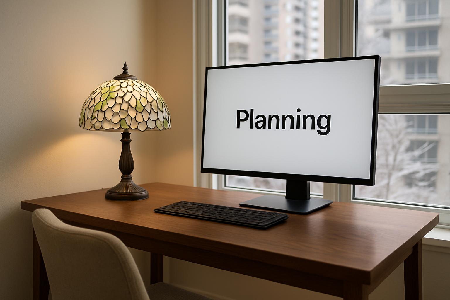
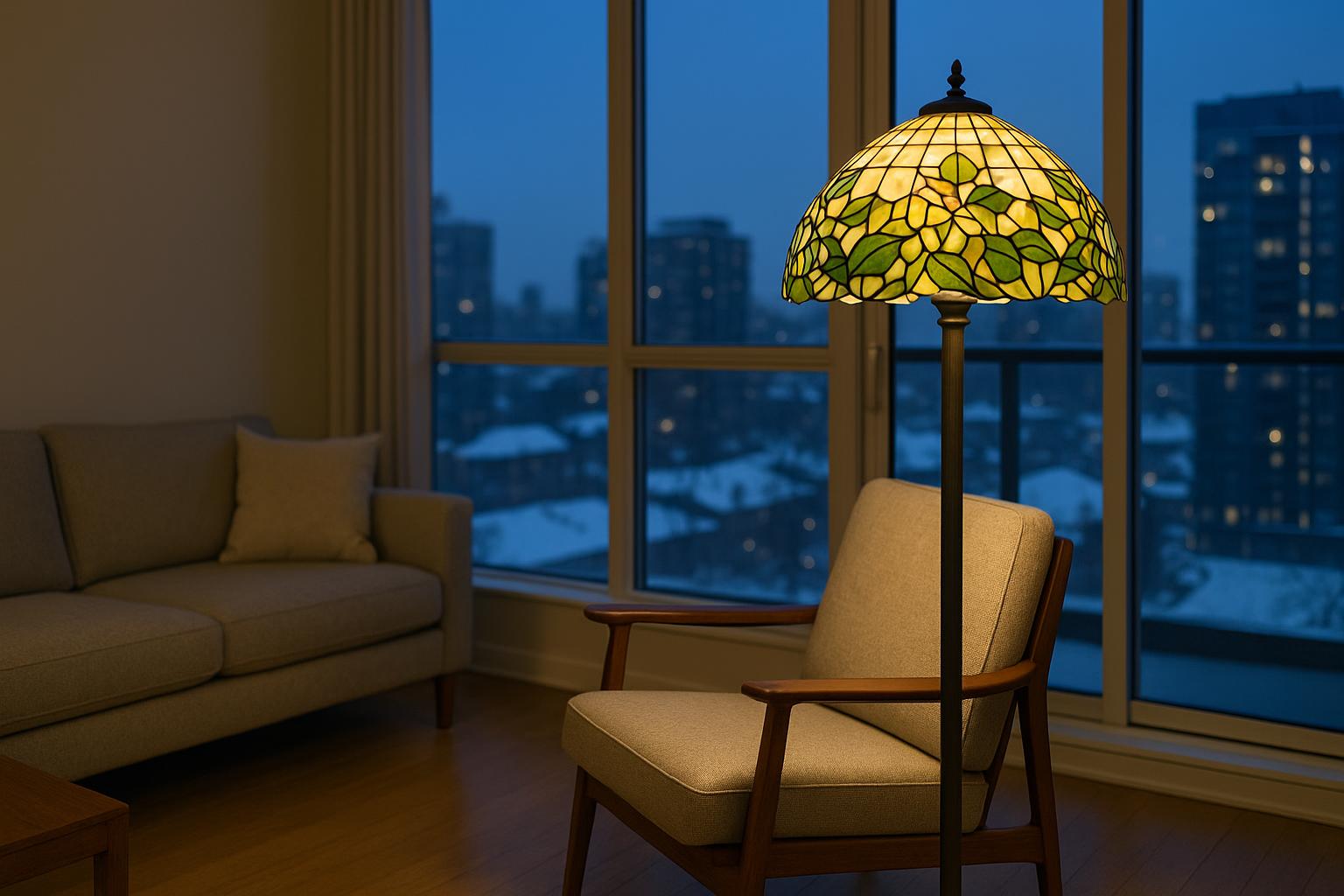
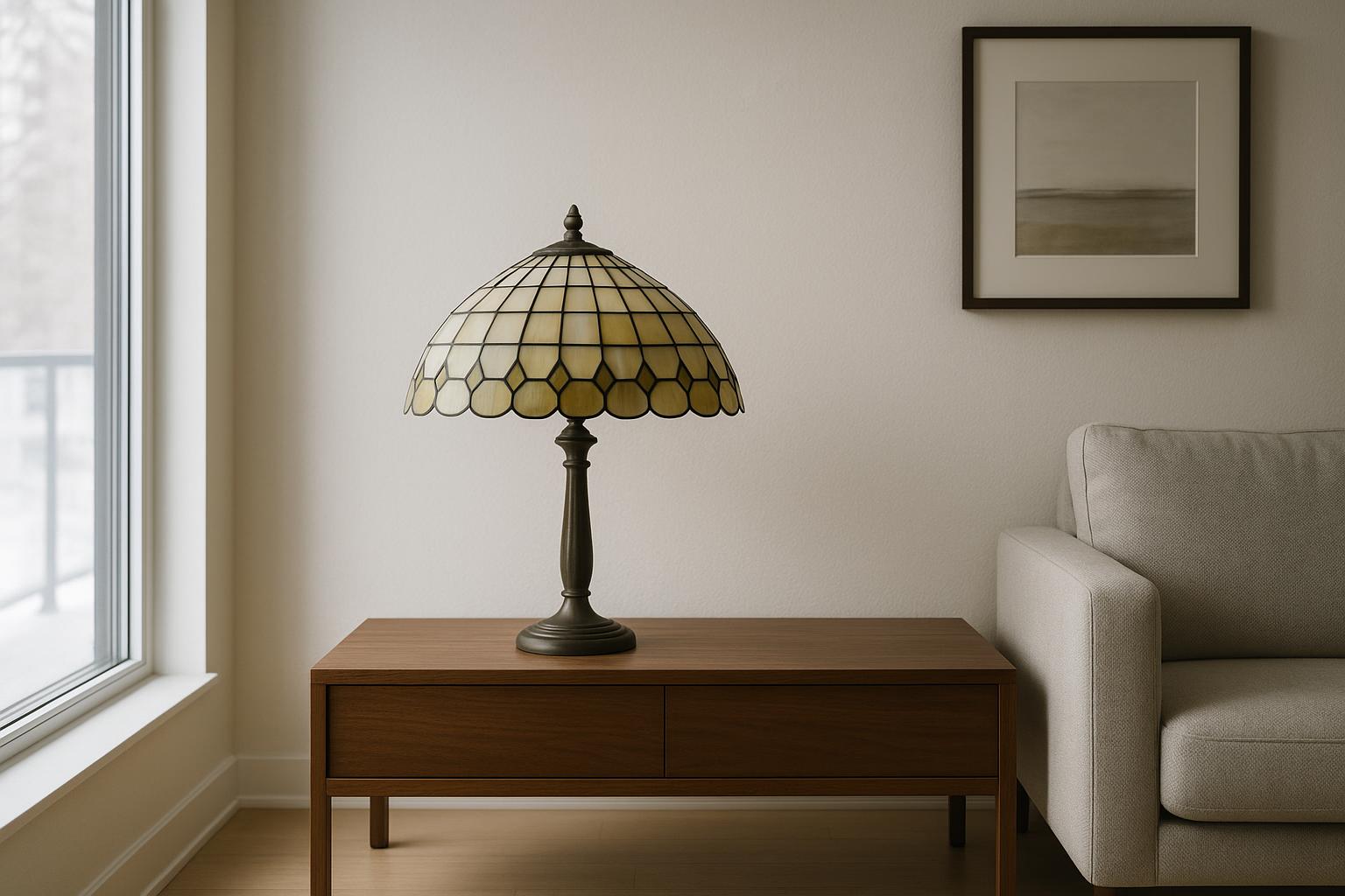
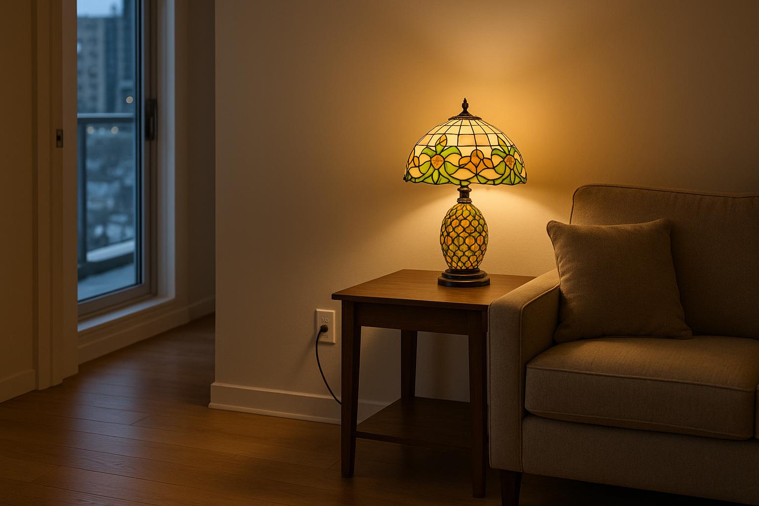
See how green, amber, red, blue and multicolour stained glass changes after dark, then choose a Tiffany-style lamp...
- There are no more items in your cart
- Shipping Free
- Total CA$0.00
How Tiffany-Style Lamp Colours Change After Sunset
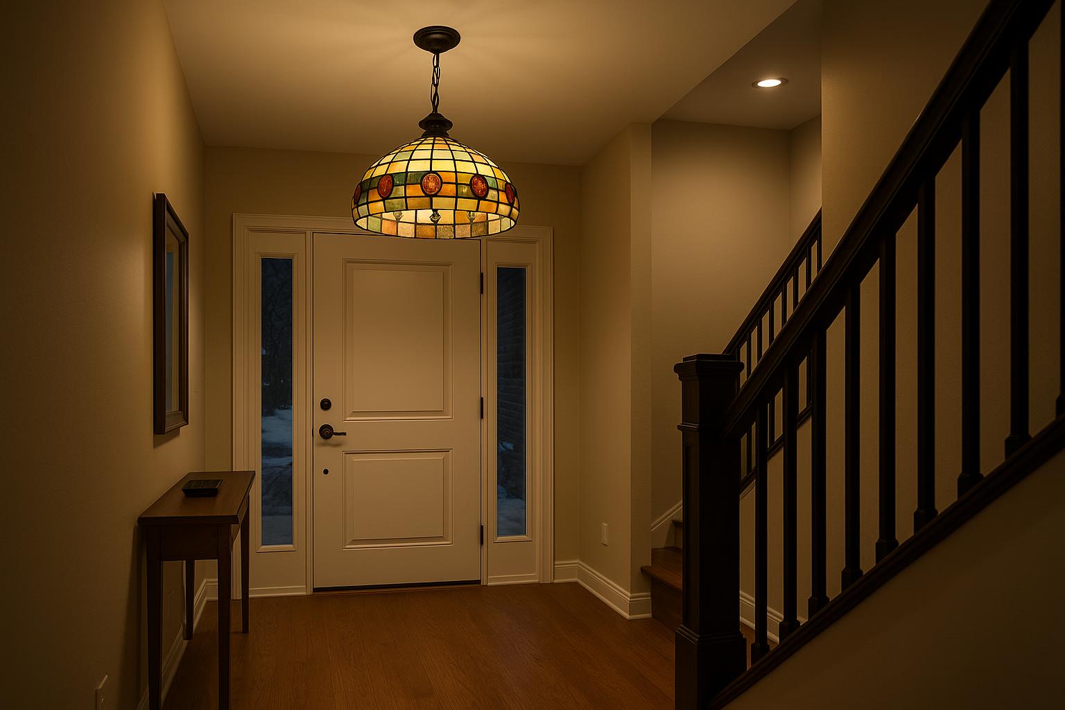
When choosing tiffany lamps by colour for canadian winter evenings, the daytime view tells only part of the story. After sunset, the lampshade becomes a bright object within the room, and colours that looked restrained near a window may appear deeper, warmer or more prominent.
Begin with the effect you want after dark. A lamp might settle a reading corner, add warmth to a pale room, create a strong focal point or connect finishes that otherwise feel unrelated. Green Tiffany lamps, amber Tiffany lamps, red Tiffany lamps, blue Tiffany lamps and multicolour lamps can all do those jobs differently.
Colour behaves differently after sunset
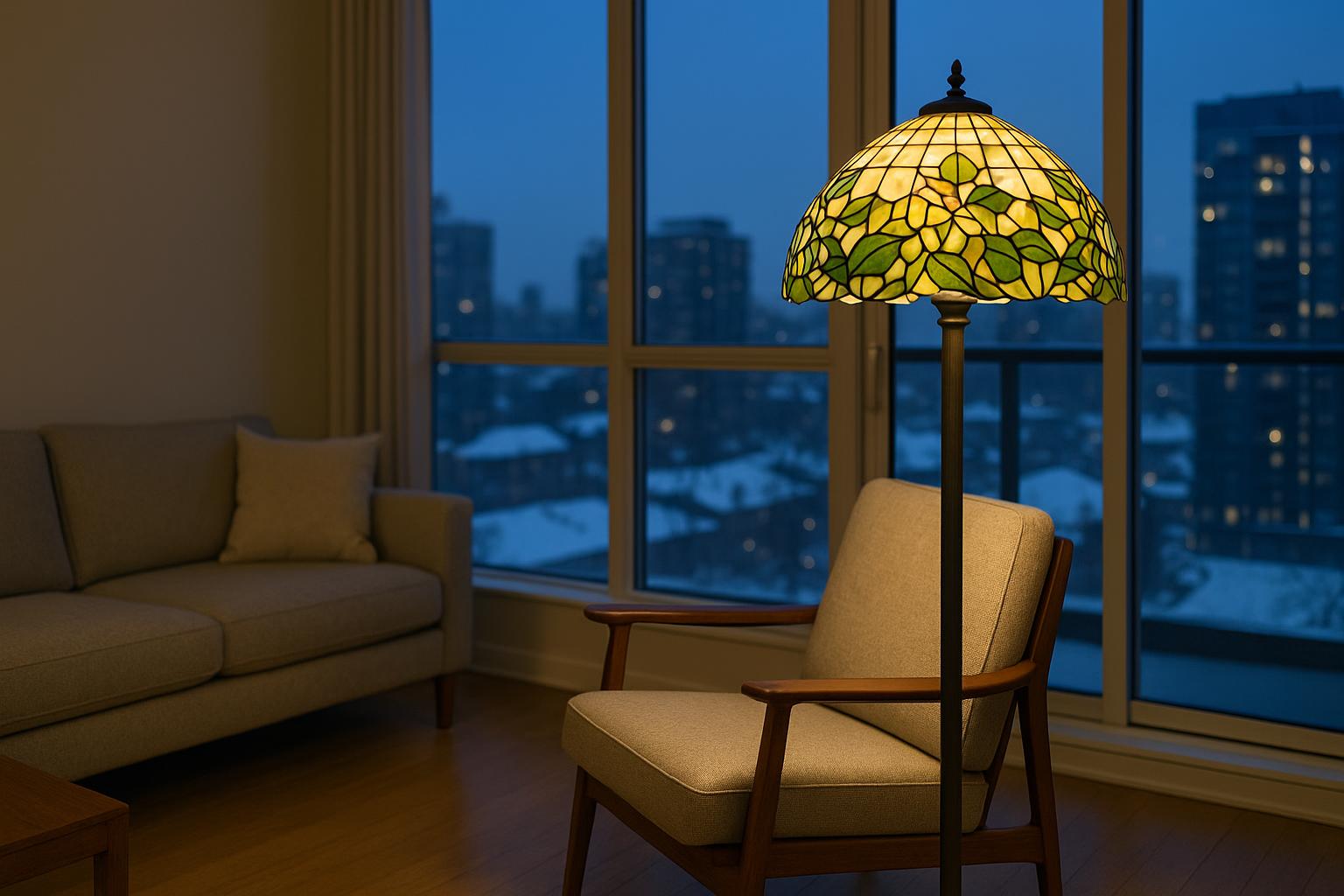
Low winter sun reveals surface texture, variations in the glass and the pattern of the joining lines. In a room with broad glazing, snow-bright daylight can also make pale glass look clearer and cooler than it does at night. Once daylight disappears, the bulb behind the shade determines which sections become luminous and which remain comparatively dense.

This does not mean that every coloured shade will wash nearby walls in vivid colour. Much depends on the opacity of the glass, the shade's shape and the other lighting in the room. The more reliable expectation is that the illuminated shade itself will gain visual weight.
Judge the lamp for the hours when it will be used most. For an evening accent, the lit appearance deserves greater weight than the way the unlit shade looks at noon.
Read the shade both lit and unlit
A Tiffany-style shade has two identities. Unlit, it acts like a decorative object and must work with furniture, flooring and wall colour. Lit, it becomes a filter: cream and pale amber pieces may brighten substantially, while saturated red, green or blue glass can retain much of its depth.
When product pages provide both views, compare them closely. Look beyond the list of colours and note where each one appears. A cream shade with a narrow green border will behave very differently from a design made with broad forest-green panels. Small ruby details may sparkle, while a large ruby field can dominate the whole composition.
Bulb choice also matters, but follow the product's stated bulb requirements. When comparing lamps at home, use approved bulbs with similar light characteristics so that you are assessing the glass rather than two noticeably different light sources.
Green for a quieter visual anchor
Olive, moss and leaf green tend to feel grounded in the evening. These colours sit comfortably with walnut, oak, cognac leather and woven textiles, making them useful in dens, reading corners and living rooms where the lamp should have presence without looking visually hot.
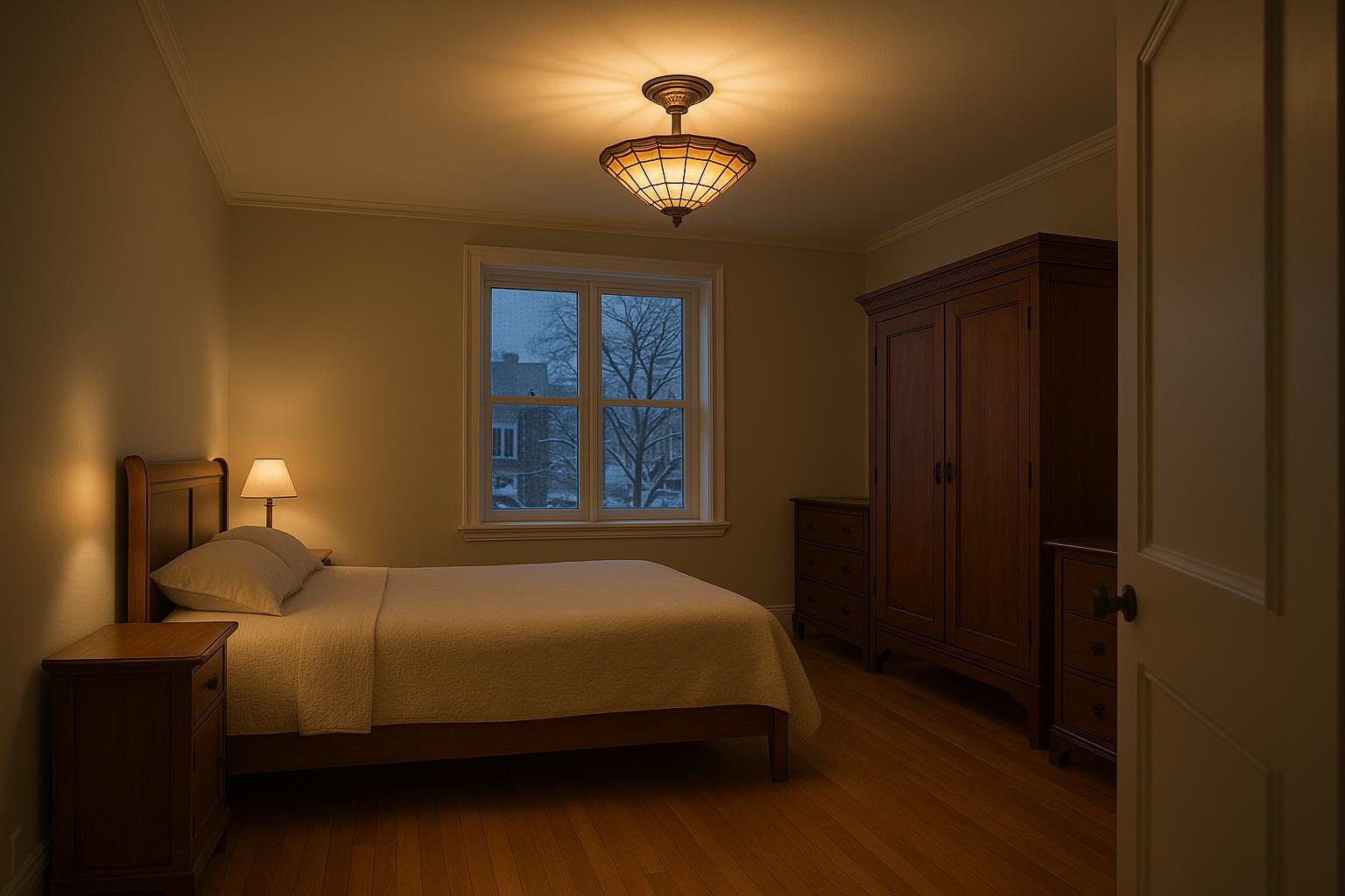
To complement this topic, you can also read From Overhead to Bedside: Layering a Bedroom After Dark.
Botanical glass is an obvious fit, but geometric green can be just as effective in a Mission- or Prairie-inspired room. In a compact Toronto condo, a green-and-cream table lamp can give definition to a neutral wall while remaining calmer than a shade built around large areas of red.
Dense green glass may transmit less useful light than paler sections. If the lamp is beside a chair or desk, check whether light reaches the page or work surface and add a separate task-lighting layer when necessary.
Separate amber warmth from red intensity
Amber and red are often treated as one warm family, but their evening effects are not interchangeable. Amber usually reads as gentle and adaptable. It works readily with honey-toned wood, cream upholstery, brick and brass-coloured details without demanding that every nearby object repeat the same hue.

Red is more emphatic. Ruby borders, berries or flower centres can animate a shade while allowing cream or amber glass to carry more of the light. Broad red panels create a stronger focal point and can make beige, taupe and warm grey surroundings appear richer.
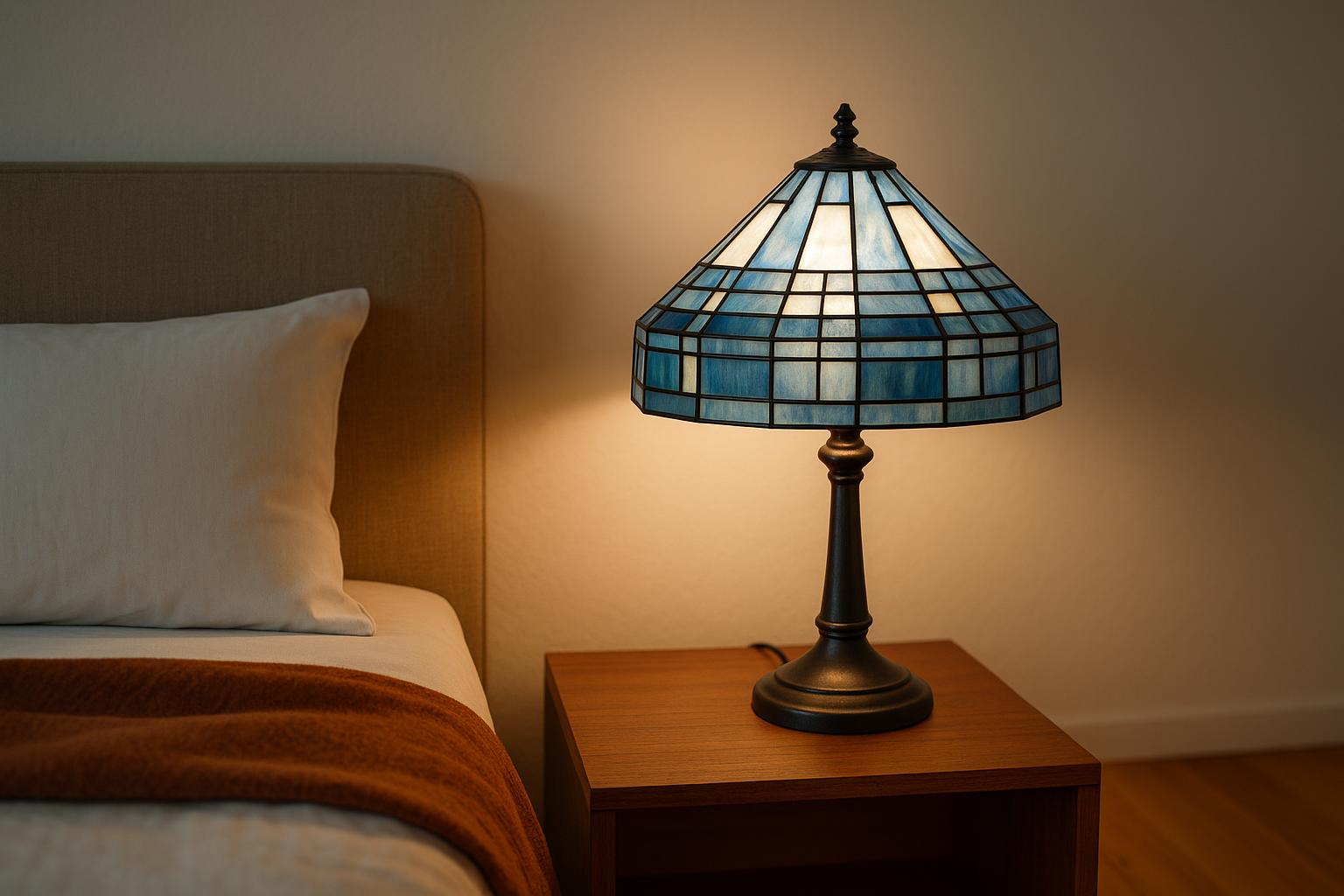
Scale changes the result. A compact amber-accented bedside lamp can feel restful on a narrow table, provided its shade and base fit safely on the surface. A red-dominant floor lamp is better able to hold its own beside substantial seating in a family room or rec room. In either case, colour alone does not indicate whether the lamp will provide enough light for reading.
Balance blue with warmer surroundings
Blue glass need not make a winter room feel cold. Navy, teal and turquoise can look composed against warm white walls, walnut furniture and camel, rust or oatmeal textiles. Those surrounding materials give the blue a warmer context without trying to disguise it.
In the same direction, Beyond Colour: Reading the Shape of a Scalloped Tiffany-Style Lamp offers useful ideas for choosing home lighting more confidently.
A single concentrated blue shade often has more impact than blue repeated across cushions, curtains, artwork and rugs. Leave some visual space around the lamp and treat it as a counterpoint rather than the start of a matching set.
If the lamp will stand near a window, inspect it after dark. Pale blue pieces that seem icy or highly transparent in strong winter daylight may reveal greener, smokier or deeper notes when illuminated from within.
Use multicolour glass to connect a room
A multicolour shade can bring together an open-concept space containing several finishes. Amber might relate to a wood floor, teal to a distant chair and a restrained red accent to brick or artwork. The lamp does not need to match any one item exactly.
Choose two colours in the glass that already appear elsewhere in the room. Let the remaining colours provide variation rather than finding an accessory for every shade. This keeps the result collected instead of overly coordinated.
Consider viewing distance as well. Numerous small pieces and sharp colour changes create a jewel-like effect at close range. Larger glass sections and a limited palette remain easier to read across a broad living area or under a vaulted cottage ceiling. Catalogue intricacy is not automatically the best choice for every room.
For more consistent lighting throughout the home, the article Using a Lighted-Base Tiffany-Style Lamp on an Unwired Wall may also be helpful.
Match colour density to the lamp's purpose
The richest shade is not necessarily the most useful one. Dense colour can be excellent for ambience, but a lamp used for paperwork, cooking or sustained reading needs enough light in the working area. Shade shape, mounting height, lamp position and approved bulb specifications all affect the result.
- For evening ambience: broad areas of deep green, red or blue can create a concentrated decorative glow.
- For reading: look for lighter glass near the lower part of the shade and confirm that the shade does not block light from the page.
- For a small accent: a compact multicolour lamp can enliven a console, bookcase or sheltered corner without controlling the entire room.
- For general illumination: use the stained-glass fixture as one layer alongside suitable ambient lighting.
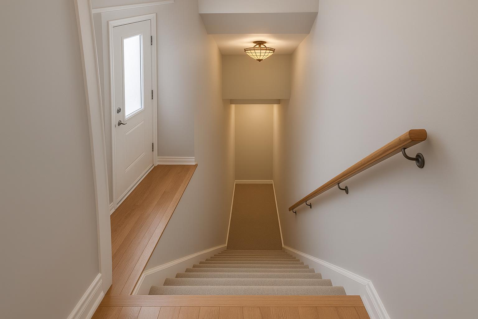
This distinction matters in basements and interior rooms with little daylight. Coloured glass can make those spaces more inviting, but walking routes, stairs and work surfaces still need clear illumination.
Make a shortlist under evening conditions
Start with permanent finishes: flooring, cabinetry, brick, stone and large upholstered pieces. Warm wood welcomes amber, many greens and restrained red. Cool grey flooring may benefit from amber contrast, while blue or green produces a quieter tonal scheme. Against patterned wallpaper, a shade with fewer dominant colours is often easier to place.

Record the available surface width, overall height and nearby clearances in centimetres, then compare them with the product dimensions. Account for seated sightlines, screens, cabinet doors and normal movement through the room. For a hardwired pendant or ceiling light, verify the installation requirements before purchase and use an appropriately qualified professional.
Once the function, density and palette are clear, shop Tiffany lamps by colour and compare a small group rather than every available design. The strongest choice will contribute to the room when unlit and become more expressive, not less practical, during the long hours after sunset.